Creating my index wire frame
Index.com
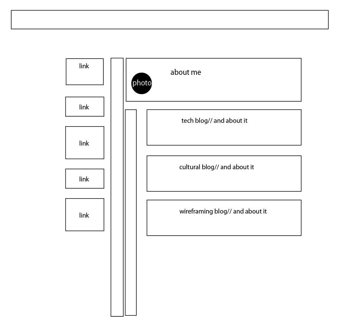
Here is the wire frame that I created prior to creating my index page. I challenged myself with the design, because I did want to make it into a tree. What do you think?

Here is the wire frame that I created prior to creating my index page. I challenged myself with the design, because I did want to make it into a tree. What do you think?
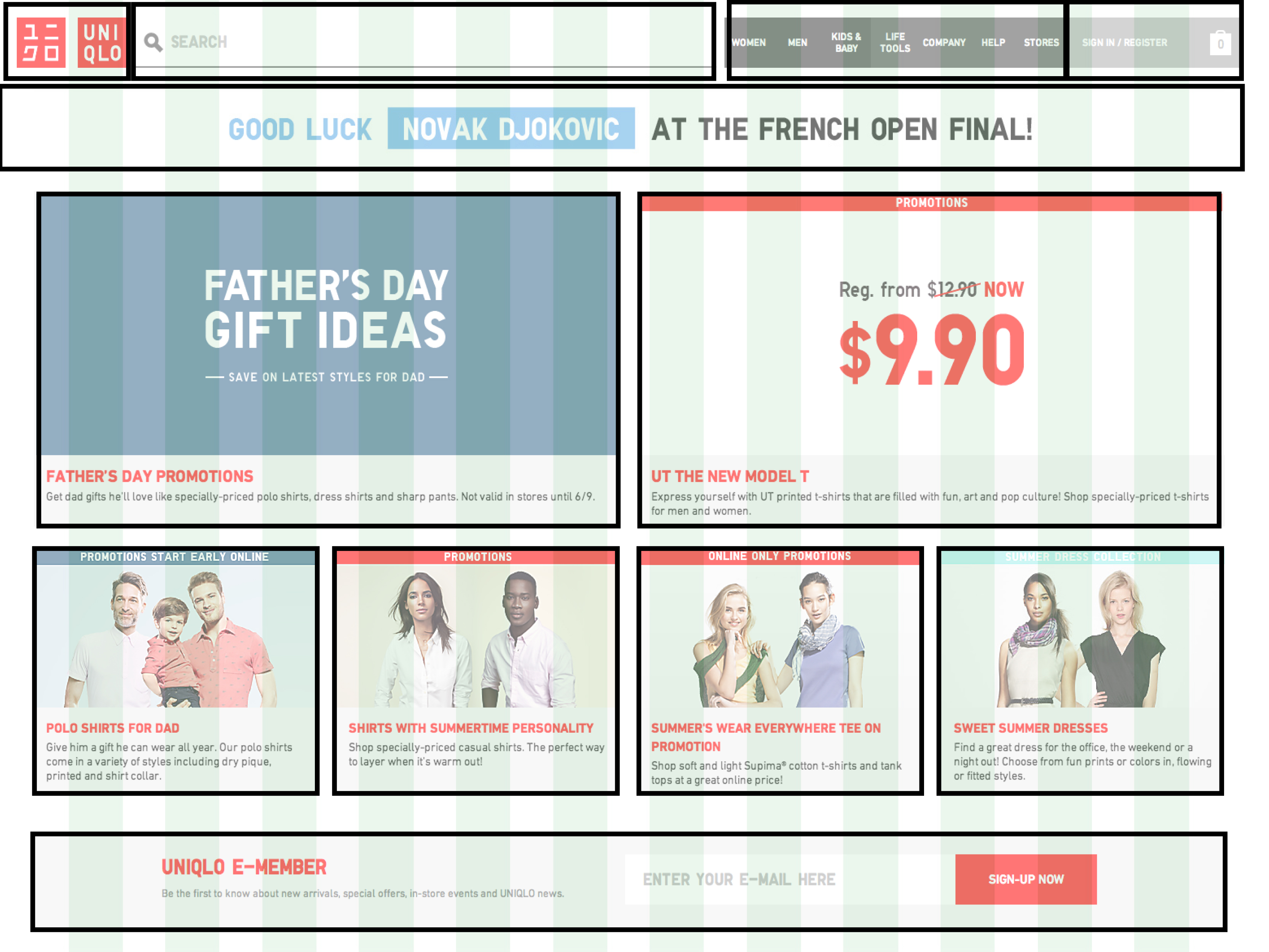
This webpage, which is the homepage for Uniqlo, allows the user to find whatever they need from the navigation bar either using the search engine or navigating through the categories drop down menu. Although, all the navigation is easily accessible the page still provides promotional ads on the page. This solves two problems…. I know what I want, where can I find it? or What is new? Solved by the promotional squares and the navigation bar. Some of the challenges for the user could be that there are a lot of distractions/promotional ads and if one had a specific purpose for visiting the site, they may end up buying more.
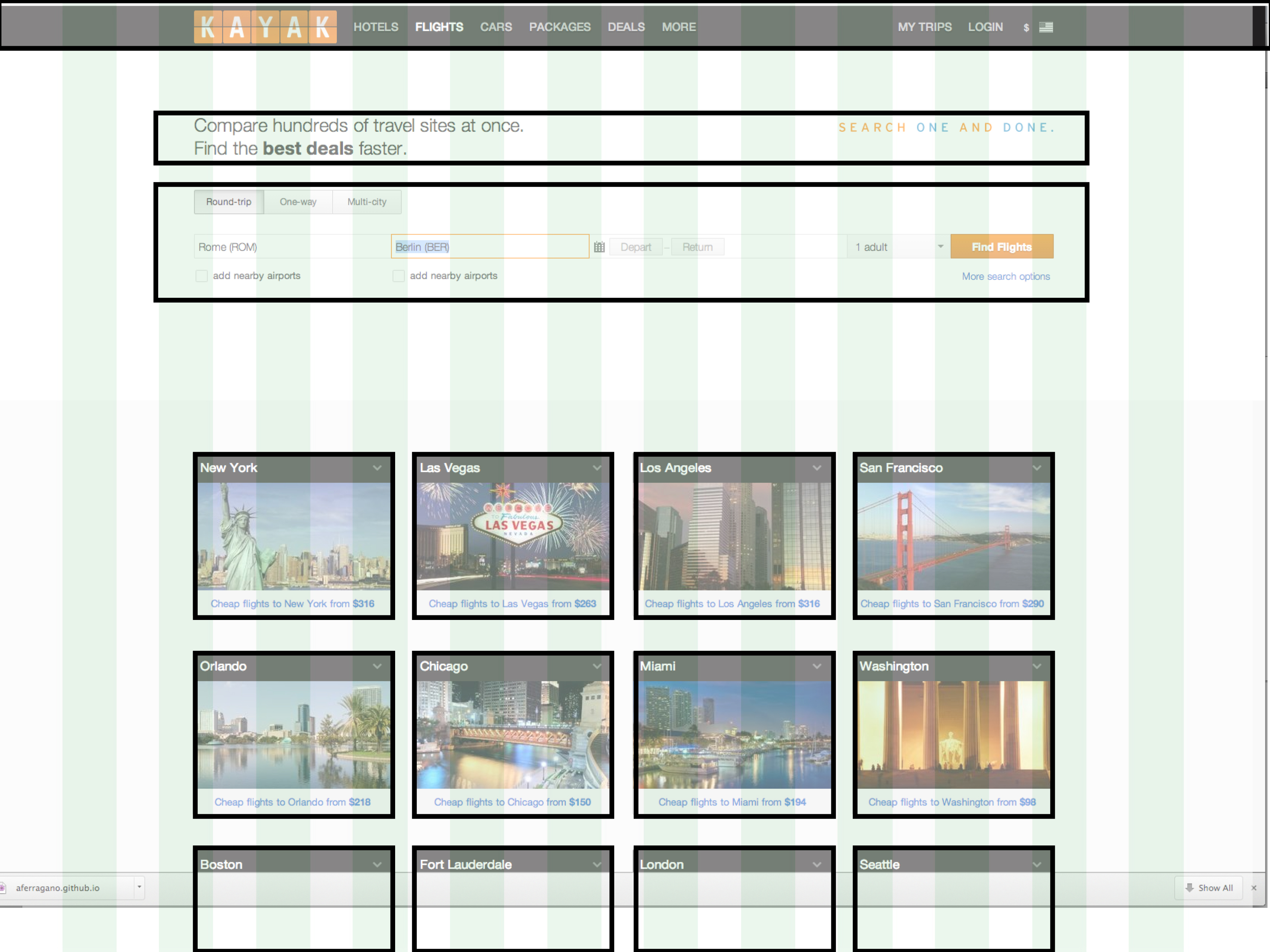
This page, from Kayak, directs you to enter your selected dates and destination for flights. It finds your flight for you, and also suggests to book a hotel/car from the navigation bar. It also has some promotions of hotels while you are searching for a flight. The visual challenge is not to distract the user away from the travel plans, but also suggests that they can look at other overs for hotels or cars. The spacing allows the user to focus on their specific plans in one general section of the webpage.
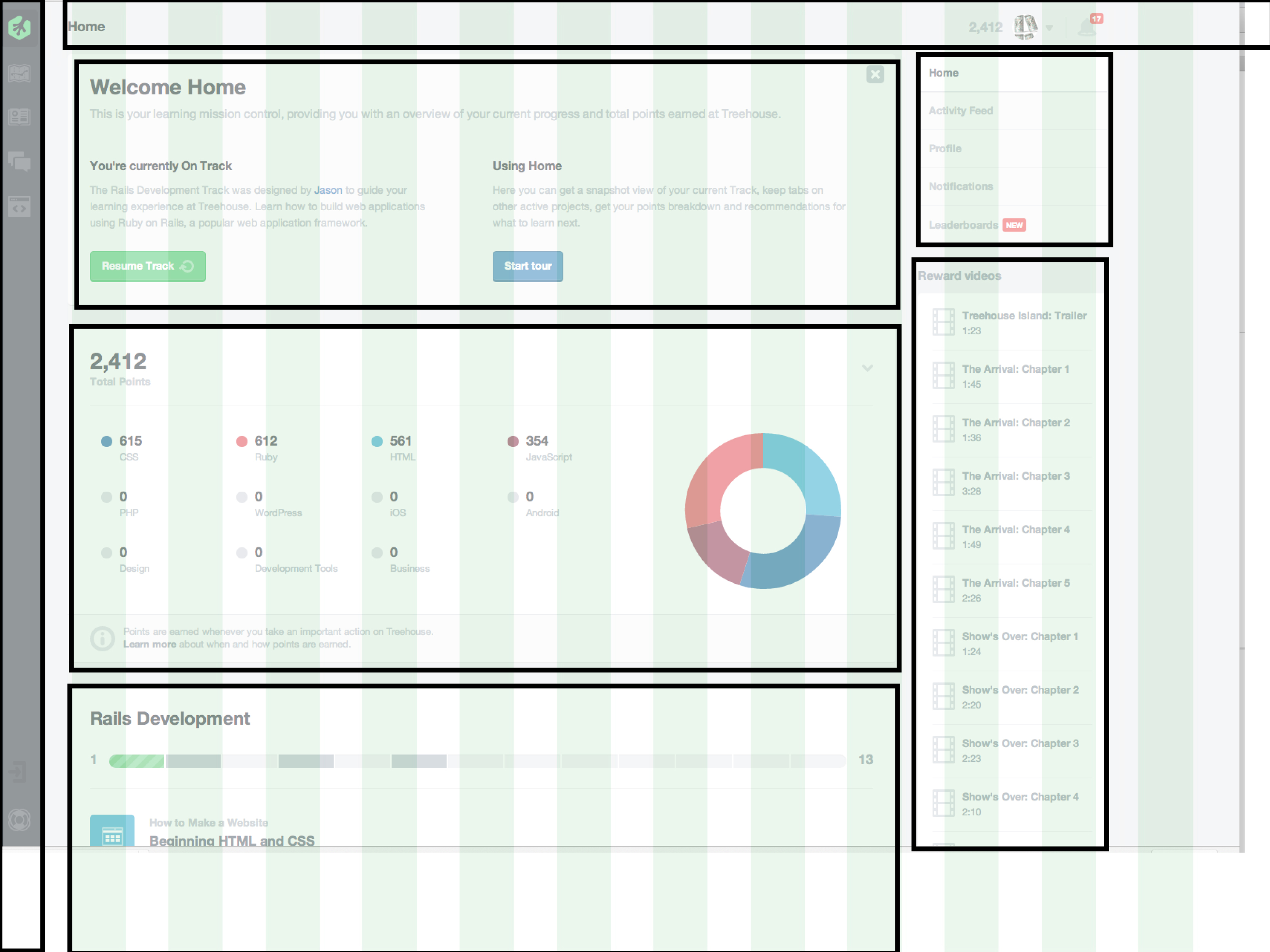
This page from Teamtreehouse.com gives the body more room than any other section, providing the user with focus on content. It only gives the user a few, small navigation areas that do not over power the content. This page shows progress and links to your last progress. This page solves, the "where did I leave off" or "where should I focus now" questions.